Beginner’s Guide to Acrylic Painting for Adults
At the beginning of acrylic painting, there is a moment that surprises most beginners: you mix what appears like a deep, saturated burgundy on your palette, brush it onto the canvas, and watch it dry into something more like dusty rose.
No one told you about that. It’s not a problem with your technique; it’s just how acrylics work. And once you know why it happens and a few other things that are unique to paint, things get easier quickly.
This guide is for individuals who are new to painting or who are coming back to art after a long time away. It concentrates on the things that are really important in the first few months, not every possible supply or approach. These are the things that will determine whether you keep going or give up in frustration.
The Honest Case for Starting with Acrylics
Acrylics have a reputation as the “beginner medium,” which makes some people dismiss them. That’s a mistake. Professional artists, including muralists, illustrators, and gallery painters, work exclusively in acrylics by choice, not necessity.
They’re water-soluble when wet, meaning cleanup takes minutes. They dry fast, which lets you build multiple layers in a single session. And unlike oils, they don’t require solvents or ventilation systems.
The fast drying time that beginners fear is actually a feature once you learn to work with it rather than against it. A layer dry in 15–20 minutes means you can correct a mistake, repaint a background, or add detail without waiting days. Oil painters often wait 24 hours between sessions to touch their work.
The real beginner challenge isn’t drying time; it’s learning to read paint consistency. That’s where most early frustration comes from, and it’s fixable.
Setting Up Your First Palette: Colors That Actually Work
You don’t need 24 colors. You need five, chosen carefully.
Start with a primary red, a primary yellow, an ultramarine blue, titanium white, and Mars black. From these, you can mix every secondary color, orange, green, violet, and an enormous range of tints and shades.
The logic here isn’t just frugality. When all your colors descend from the same three primaries, they share a chromatic DNA. The resulting mixes feel harmonious in a way that a painting filled with pre-mixed tube colors often doesn’t.
One color choice worth thinking about carefully: your red. A red that leans warm (toward orange) makes excellent oranges but muddy purples. A cooler red cadmium red is a reliable option that balances better across both. Similarly, cadmium yellow is significantly more opaque and pigment-dense than cheaper student alternatives.
Of all the colors to buy in artist-grade rather than student-grade paint, yellow and white matter most. Student-grade cadmium yellow in particular has so little pigment that it barely covers anything, which becomes maddening when you’re trying to lighten a mix.
Speaking of white, you’ll go through titanium white faster than any other color. Buy the large tube.
A Note on Paint Quality
There are three tiers: craft paint (think craft store bottles), student grade, and artist/professional grade. Craft paints are heavily diluted with fillers and binders. When they dry, the pigment disperses, and you get a flat, chalky result that’s hard to paint over cleanly.
They’re fine for projects where vibrancy doesn’t matter, but not for learning to paint.
Student-grade paints from brands like Winsor & Newton Galeria or Liquitex Basics are workable and reasonably affordable. Artist-grade paints, such as Golden Heavy Body and Liquitex Professional, are significantly more pigmented and more expensive. Still, a small amount goes a long way because the coverage is so much better.
A practical approach: buy most colors in student grade, but splurge on titanium white and your primary yellow in artist grade. The difference in those two colors specifically is immediately noticeable.
Surfaces: What You Paint On Changes Everything?
Canvas boards, with thin canvas glued to a cardboard backing, are ideal for the first few months. They’re inexpensive, take up minimal storage space, and let you experiment without the pressure of ruining something expensive. A pack of ten 8×10 boards costs roughly $15–20 and gives you real room to practice.
If you want the traditional stretched canvas feel, look for gallery-wrap canvases (the kind with thick 1.5-inch deep edges). You can paint the sides and hang them without a frame, which makes them more satisfying to finish and display.
For paper surfaces, Strathmore 400-series Mixed Media paper handles acrylics well without buckling the way lighter papers do. It has enough texture to hold the paint but a smooth enough surface for detail work. If you prefer a paper pad format to a stack of boards, this is the most reliable option.
One thing beginners often skip: most commercial canvases come pre-primed with gesso so that you can paint directly on them. If you ever want to paint on wood, MDF, or unprimed canvas, apply two thin coats of gesso first and let each dry completely. Skipping this causes the paint to soak in unevenly and adhere poorly.
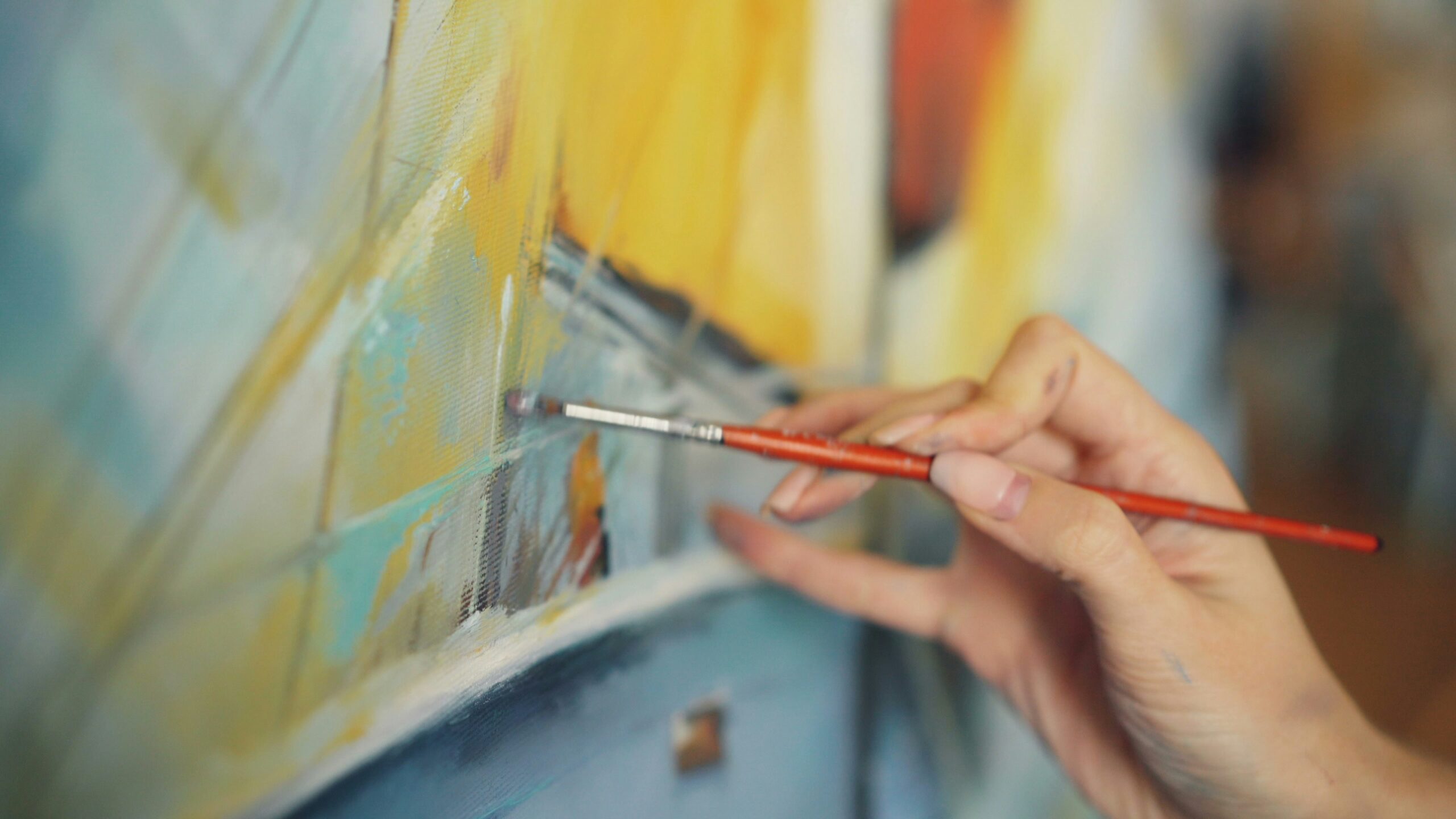
Brushes: Two Is Enough to Start
The brush aisle is one of the more overwhelming parts of any art supply store. Ignore most of it for now.
Two brush types cover 90% of what beginners need: a flat brush and a round brush, both synthetic. Natural hair brushes absorb water and swell unpredictably with water-based paints; they’re made for oil or dry media.
A flat brush (size 8 or 10 to start) handles backgrounds, large shapes, and broad strokes. It also creates interesting angular marks when you work with the edge rather than the face of the bristles. A round brush (size 4 or 6) handles details, curved lines, and smaller shapes.
The most common beginner mistake with brushes isn’t the type, it’s the size. Beginners instinctively reach for small brushes, thinking of more control. But working on a 9×12 canvas with a size 2 round brush is genuinely exhausting. The brush is fighting the scale of the work. Go larger than you think you need.
Also, never leave brushes resting bristle-down in your water jar. Even 20 minutes in that position can permanently bend the bristles into a curve. Lay them flat on a paper towel between strokes, or rest them bristle-up in a jar.
Understanding Consistency: The Skill Nobody Talks About
Here’s what causes most early acrylic frustration: beginners use paint straight from the tube for everything, which gives them too-thick paint that drags, or they add too much water trying to fix it, which makes the paint transparent and weak.
The fix is learning to work at different consistencies intentionally.
Thick (tube consistency or close to it): Good for texture, impasto effects, palette knife work, and anything where you want a visible brushstroke. Use it for bold marks and foreground details.
Medium (a small amount of water added): The workhorse consistency. Paint moves smoothly but still covers well. Most of your painting happens here.
Thin (significantly diluted): Creates washes and glazes. Transparent layers that tint what’s underneath rather than covering it. Useful for building shadows or color depth over dried layers.
The glazing technique, applying a thin, transparent layer of color over dried opaque paint, is one of acrylics’ most powerful tools. A thin wash of burnt sienna over a dried yellow-green underpainting can transform it into a warm autumn tone without losing the underlying texture.
This is why building in layers, rather than trying to mix the perfect color in one application, produces richer-looking work.
Value Before Color: The Concept That Separates Good Paintings from Muddy Ones
Value refers to how light or dark a color is, completely separate from its hue. A bright yellow and a mid-range blue can occupy the same point on the value scale even though they’re very different colors.
When all the values in a painting cluster in the same middle range, the result looks flat and lifeless, even if the colors are technically accurate.
The clearest way to train your eye for value is to paint one or two small studies in black, white, and gray before introducing color. This isn’t tedious preparation; it’s one of the fastest ways to understand why some paintings have depth and punch, and others don’t. When you add color later, you’re adding information on top of a value structure that already works.
A practical test: take a photo of your painting and convert it to black and white on your phone. If the composition reads clearly, if you can still see the focal point, the light and shadow, the values are working. If everything flattens into the same gray, the painting needs more contrast.
Common Mistakes (and What’s Actually Happening)
Mud: Usually caused by overmixing complementary colors (red and green, blue and orange, yellow and violet) or layering wet paint on top of wet paint with a dirty brush. The solution is letting layers dry between passes and cleaning your brush more frequently.
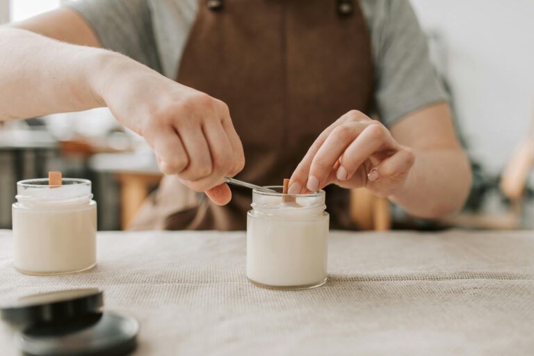
Paint drying on the palette: Acrylics skin over within minutes on a standard palette. A stay-wet palette, a sealed tray with a damp sponge and special membrane paper keeps paint workable for hours and even days when sealed. Worth the $20 investment once you’re painting regularly.
Colors looking different dry: Acrylics dry slightly darker and more matte than they appear wet. The shift is most noticeable with lighter colors. You’ll calibrate for this over time. A light coat of gloss medium or varnish at the end of a painting can restore some of the wet-looking vibrancy.
Overworking a passage: Acrylics don’t blend as easily as oils, and beginners often keep working a wet area trying to fix it, which muddies the color and damages the surface. Sometimes the better move is to let it dry fully and repaint cleanly over the top. The fast drying time makes this viable.
A Simple First Painting Project
Paint a landscape with three values: a sky, a horizon line with simple land shapes, and a foreground. Mix three distinct tones: a light, a mid, and a dark, and don’t allow yourself to use more. Fill the entire canvas with these three tones only.
This constraint forces you to make decisions about value placement without the distraction of color mixing. It’s not about making something beautiful; it’s about making something that reads clearly. Once you can do that in grayscale, introduce color by mixing a single hue into each zone while maintaining those same value relationships.
Most people are surprised by how satisfying the result is. Three values, handled confidently, are enough to create the illusion of space and light.
Staying with It
Acrylic painting has a steeper learning curve in the first month than most people expect, followed by a satisfying plateau where things start clicking. The consistency intuition develops. You stop fighting the drying time. You notice when a painting needs more contrast before you can articulate why.
The painters who improve fastest aren’t the ones with the best supplies; they’re the ones who finish things, even imperfect things, rather than abandoning half-finished canvases. A completed painting, however rough, teaches you more than a perfect one you never started.