
The difference between a frustrating calligraphy session and a successful one rarely comes down to raw talent. More often than not, it comes down to the friction between your tools and your technique.
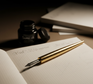
When you first pick up a pointed pen, the experience is profoundly different from using a standard ballpoint or even a fountain pen. The metal tines of a calligraphy nib must physically spread apart under pressure to release ink, demanding a completely different relationship with paper, ink viscosity, and hand control.
If you try to learn this physical skill using the generic “starter kits” found in big-box craft stores, you will likely encounter jagged upstrokes, ink blobs, and shredded paper fibers.
Building a reliable, foundational toolkit and an intentional practice routine is the only way to bypass these early technical hurdles.
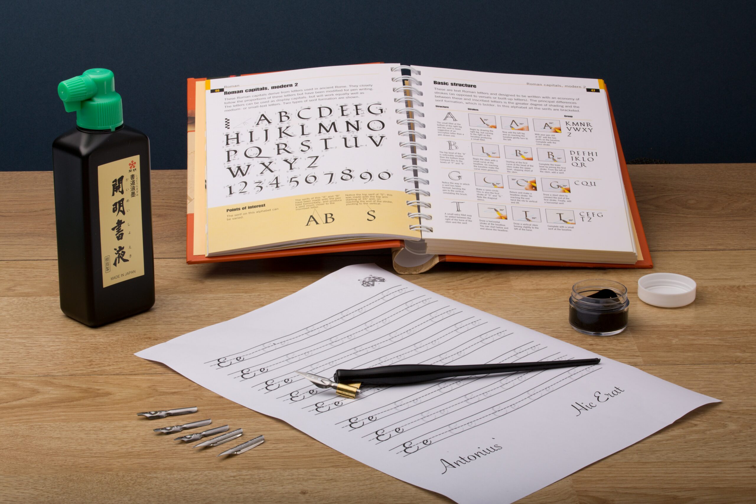
The Foundational Toolkit
A functional beginner setup requires specific, intentional choices. You need tools that offer a wide margin for error while you build fine motor control.
The Nib: Balancing Flexibility and Sharpness
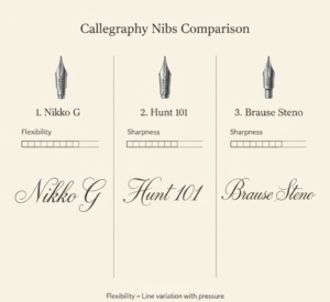
Calligraphy nibs are governed by two primary characteristics: flexibility and sharpness.
A highly flexible nib requires very little pressure to open the tines, creating dramatic, thick downstrokes. However, this hyper-responsiveness makes it incredibly difficult for a beginner to control; the slightest accidental pressure on an upstroke will ruin your thin hairlines.
Conversely, sharpness dictates the thinness of your upstrokes. A razor-sharp nib produces breathtaking, hair-thin lines but easily catches on the microscopic fibers of your paper, causing the ink to splatter and the pen to stutter.
For your first several months, the Nikko G nib is the undisputed gold standard. Initially designed for manga artists, this Japanese nib hits the perfect “Goldilocks” zone. It possesses medium flexibility, meaning you have to apply deliberate, noticeable pressure to get a thick downstroke, which prevents accidental thickening.
It also has a medium sharpness, allowing it to glide over paper much more smoothly than aggressive specialty nibs like the Brause Rose.
If you inherently write with a heavy hand and want a script with extreme contrast, you might eventually graduate to a Hunt 101, which is sharper and more flexible, but expect a steeper learning curve.
| Calligraphy Nib | Flexibility | Sharpness | Best Use Case |
|---|---|---|---|
| Nikko G | Medium | Medium | Absolute beginners; smooth, forgiving practice. |
| Hunt 101 | High | High | High-contrast scripts; requires a lighter touch. |
| Brause Steno (“Blue Pumpkin”) | Medium | Low (Dull) | Modern calligraphy creates thick, bold lines everywhere. |
| Gillott 303 | Medium-High | High | Traditional, delicate scripts; catches easily on paper. |
The Pen Holder: Straight vs. Oblique
You will insert your nib into a pen holder. Standard straight holders align the nib parallel to the grip. If you are left-handed, a straight holder is usually perfectly aligned with your natural writing angle.
If you are right-handed, an oblique holder is highly recommended. An oblique holder features a metal or brass “flange” extending off the side. This is not an ergonomic gimmick; it is a structural necessity for right-handed writers attempting traditional scripts like Copperplate, which requires a steep 55-degree slant.
The oblique flange mathematically corrects your hand position, allowing the tines to open evenly on the slanted downstroke. Using a straight pen as a right-hander forces you to contort your wrist to achieve that 55-degree angle.
Pro-tip: An affordable starting point is a Speedball plastic oblique or a Moblique 2-in-1, which allows you to test both straight and oblique configurations.
Paper: Understanding “Tooth” and Friction
In calligraphy, paper is not just a surface; it is an active variable. The texture of paper is known as its “tooth”.
Standard copy paper is highly absorbent and has a rough, fibrous tooth. If you use a metal nib on this surface, the sharp tines will literally shave the fibers off the paper, accumulating a tiny clump of pulp on your nib.
The absorbency causes ink to “feather,” spreading through capillary action outward from your intended stroke and bleeding straight through to the desk.
If you are practicing modern brush pen lettering with felt-tip markers like a Tombow Dual Brush, standard printer paper acts like sandpaper, fraying and ruining your expensive pens in a matter of days.
For practice, you must use smooth, treated paper.
- HP Premium 32lb (120gsm): A thick, hyper-smooth laser-jet paper that handles dip pen ink beautifully. It is cost-effective for daily drills.
- Canson Marker Pad (70gsm): A semi-translucent, coated paper. It is highly bleed-proof, incredibly smooth, and thin enough that you can place a printed guideline sheet underneath, saving you from manually ruling lines.
Ink: Viscosity Matters
For daily practice, Moon Palace Sumi ink is the most reliable choice. Unlike thin, watery fountain pen inks that run off the nib, Sumi ink has a slightly thicker viscosity.
This allows it to cling to the metal nib via surface tension and flow onto the paper with high opacity. You can easily decant it into a smaller, wide-mouth jar for easy dipping.
Setting Up for Success
Before the pen ever touches paper, two physical preparations must happen to prevent immediate failure.
1. Removing the Manufacturer’s Coating
New metal nibs arrive from the factory coated in a thin, invisible layer of oil to prevent rusting during shipping and storage. If you dip a brand-new nib directly into ink, the oil breaks the surface tension, causing the ink to pool into droplets and fall off instantly.
You must “prep” the nib. You can gently wipe it with Windex, scrub it lightly with a toothbrush and dish soap, or use saliva on a paper towel to rub the oil away. Once prepped, the ink will coat the metal in a smooth, even film.
2. The A.R.S. Grip Method
Holding the pen incorrectly is the fastest way to get ragged lines. Master the Angle, Rotation, and Slant (A.R.S.) method:
- Angle: The pen should meet the paper at roughly a 45-degree angle. If you hold the pen too vertically, the sharp tip will dig into the paper like a needle. If held too horizontally, the ink will dump in a puddle.
- Rotation: The top of the nib (where the vent hole is) must face the ceiling. Do not roll the pen to its side, or only one tine will scratch the paper.
- Slant: The axis of the pen should remain parallel to the slant lines on your guide sheet.
A Structured Practice Plan
One of the most profound paradigm shifts in learning this craft is realizing that calligraphy is not handwriting; it is drawing letterforms. You are constructing letters out of standardized, individual shapes. If you sit down and try to write your name in one continuous, cursive motion, it will look chaotic and messy.
The 8 Fundamental Strokes
Every letter in the lowercase traditional alphabet is built by combining these fundamental strokes. You must build muscle memory for these shapes before moving to letters.
- Entrance Stroke: A light, upward curve.
- Underturn: A “U” shape; heavy pressure down, light pressure up.
- Overturn: An upside-down “U”; light pressure up, heavy pressure down.
- Compound Curve: A wave combining an overturn into an underturn.
- Oval: A heavy left side curving into a thin right side. This notoriously takes the longest to master.
- Ascending Loop: An upward sweep turning into a heavy straight stem.
- Descending Loop: A heavy straight stem turning into a light upward sweep.
- Full Pressure Stroke: A simple, heavy straight line.
Execution Metrics
Place a protective “guard sheet” of scrap paper under your resting hand to prevent skin oils from degrading the paper’s surface. Dip your nib only slightly past the vent hole to avoid overloading the pen.
As you practice the basic strokes, apply these metrics:
- Speed: Each stroke should take between 3 and 6 seconds from start to finish. A common mistake is writing the upstroke slowly and speeding through the heavy downstroke. Your hand speed must remain identically slow for both thick and thin lines to maintain sharp transitions.
- Pressure: The thin upstrokes are achieved merely by the weight of the pen resting on the paper.
Real-World Case Study: Constructing the Letter ‘a
Let’s look at how the basic strokes form a letter. Many beginners try to draw an a without lifting their pen, resulting in warped proportions.
In pointed pen calligraphy, the lowercase a ‘ is three separate movements. First, you draw an entrance stroke and physically lift your pen off the paper. Next, you position your pen to draw the oval stroke, meeting the top of the entrance stroke, and lift your pen again. Finally, you draw an underturn stroke that kisses the right side of the oval.
By lifting the pen after every single stroke, you reset your hand position, allowing you to focus on the exact thickness and spacing of the following structural element. This segmented construction is the secret to professional-looking consistency.
Tool Maintenance
Pointed pens demand rigorous hygiene. If the ink dries inside the tines or behind the flange, the pen is essentially ruined.
- Keep a small jar of water and a lint-free paper towel on your desk.
- Every few minutes during practice, swish the nib in the water and wipe it completely dry.
- If you allow Sumi or acrylic ink to dry and crust on the metal, you can use an old toothbrush with baking soda and water to scrub it out.
- Never store nibs while wet, as they are high-carbon steel and will rapidly rust.
Summary
The art of calligraphy is a combination of physics and perseverance. By investing in the appropriate foundational tools, a Nikko G nib, a suitable holder, Sumi ink, and high-quality smooth paper, you can immediately eliminate the vast majority of mechanical frustrations that compel novices to give up.
From that point forward, your success is entirely contingent upon the deliberate pacing. Respect the anatomy of the letters, elevate your pen between shapes, and slow down to three to six seconds per stroke. The mechanics will gradually recede into the background as a result of consistent, mindful practice, and the art of the script will take precedence.
FAQs
Why is my ink “railroading” (creating two parallel lines with no ink in the middle)?
Railroading occurs when you press hard on the downstroke, but the ink flow breaks. This usually means your ink is running low, your ink has evaporated and become too thick (requiring a drop of distilled water to thin it), or you have residual oils on the nib.
Can I use watercolor paper for daily practice?
While watercolor paper (especially cold-press) is beautiful for final, framed pieces, it is highly textured. The “tooth” will catch your sharp, pointed nib constantly. For daily drills, stick to hyper-smooth marker paper or premium laser-jet paper.
My upstrokes are shaking uncontrollably. How do I fix this?
Shaky upstrokes are entirely normal. Your hand is recruiting small stabilizing muscles it has never used before. Ensure you are not “death-gripping” the pen, remember to breathe smoothly, and use your whole arm to push the pen upward rather than just pinching your fingers. It requires weeks of daily drills to build this specific muscle memory.
Is there a governing body or standard for these traditional scripts?
Yes. If you wish to study the exact historic proportions of traditional scripts like Copperplate or Spencerian, resources from IAMPETH (The International Association of Master Penmen, Engrossers and Teachers of Handwriting) provide the highest industry standard for historical accuracy and technique.