
It might be very strange to go from using traditional tools like pencils and canvas to a luminous screen. When you first open a digital canvas, the plethora of menus, sliders, and brush possibilities can make it hard to make a choice. But the truth is that digital illustration is one of the easiest kinds of art to try out.
Changing a colour palette after a piece is done, undoing a wrong brushstroke, or resizing a character’s eye that you sketched a little too small, changes the whole creative process.
Digital art doesn’t replace the basics of art, including anatomy, perspective, or colour theory. Instead, it gives you a handy set of tools to use those basics.
Choosing Your Hardware: Trade-offs and Realities
You need a way to tell the computer what your hands are doing before you can draw a line. A regular computer mouse doesn’t have pressure sensitivity, which means that the line won’t go thinner or thicker depending on how hard you press. You need a sketching tablet to get that natural look.
There are three main types of hardware, and each has its own pros and cons when it comes to cost, comfort, and how easy it is to learn.
1. Graphics Tablets (Pen Tablets)
These are blank, opaque plastic pads that plug into your computer. As you draw on the pad, you look up at your computer monitor to see the lines appear.
- The Trade-off: The disconnect between your hand and your eyes creates a steep learning curve. It takes most beginners a few weeks to build the hand-eye coordination required to draw comfortably.
- Cost & Practicality: This is the lowest-risk entry point. Reliable models like the Wacom Intuos start around $50 to $100. They are highly durable and take up minimal desk space.
2. Display Tablets (Pen Displays)
These tablets act as a secondary computer monitor that you draw directly onto using a stylus.
- The Trade-off: While they offer a natural drawing experience mimicking pen on paper, they must remain tethered to your desktop or laptop via HDMI and USB cables. They are not standalone devices.
- Cost & Practicality: Models from Wacom, Huion, or XP-Pen range from $200 for smaller 13-inch screens up to $2,000+ for massive 24-inch studio displays.
3. All-in-One Mobile Tablets
Devices like the Apple iPad Pro or Samsung Galaxy Book5 360 operate independently. They combine the computer, the screen, and the drawing interface into a single portable unit.
- The Trade-off: You are paying a premium for portability. Furthermore, accessories like the Apple Pencil often require an additional $100+ investment on top of the base device.
- Cost & Practicality: Expect to spend $800 or more. However, the ability to draw on a couch, in a café, or during a commute makes this the preferred setup for many modern professionals.
Comparing Industry-Standard Software
Your hardware is only as good as the software running on it. While it is tempting to jump straight into free apps, learning industry-standard software early on saves you the headache of migrating your workflow later.
| Software | Pricing Model | Best For | Key Trade-offs |
|---|---|---|---|
| Adobe Photoshop | $22.99/month subscription | Professional industry-standard illustration and heavy photo manipulation. | Expensive recurring cost. The interface is complex and not strictly tailored for drawing beginners. |
| Clip Studio Paint | $58.50 one-time (PRO version on PC) | Comic creation, manga, webtoons, and line-art heavy styles. | The iPad version requires a monthly subscription (starting at $0.99). |
| Procreate | $12.99 one-time purchase | Mobile artists using iPads. Intuitive, gesture-based UI. | Exclusive to Apple devices. Lacks advanced text and layout features found in desktop software. |
| Krita | Free (Open-source) | Budget-conscious beginners wanting a powerful brush engine on PC. | Brush performance can occasionally feel sluggish on older hardware compared to paid alternatives. |
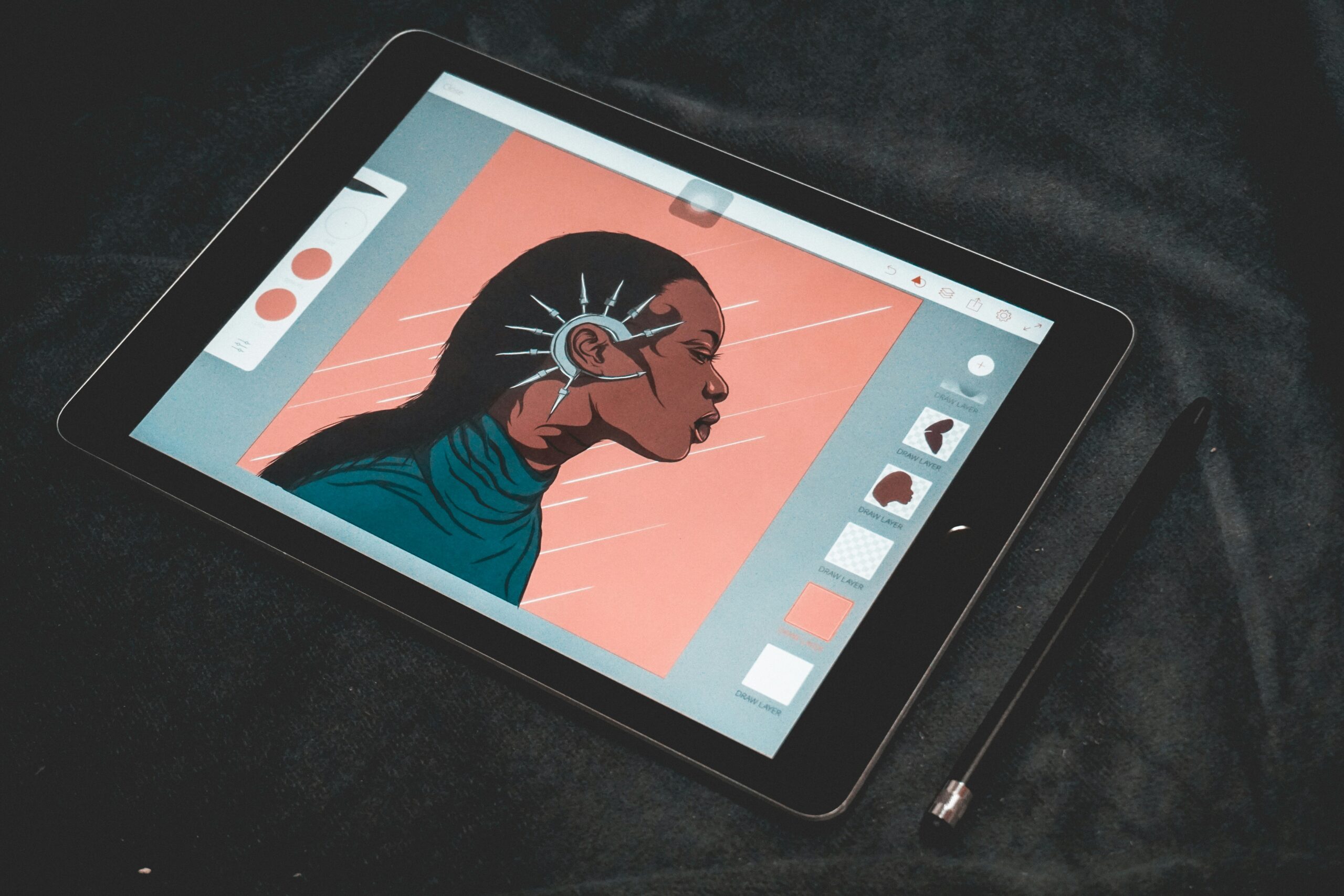
Essential Digital Workflow: A Step-by-Step Implementation
Creating digital art involves a structured workflow. Approaching a digital painting the way you would approach a traditional oil painting—doing everything on a single flat canvas—destroys the primary benefit of digital art: non-destructive editing.
Here is a standard, efficient workflow used by professionals.
Step 1: The Rough Sketch
Many artists still prefer sketching their initial ideas on physical paper because the tactile feedback is unmatched. You can easily snap a photo of your paper sketch and import it into your software. Alternatively, use a digital pencil brush. Create a dedicated “Sketch” layer and keep your lines loose.
Step 2: Clean Linework (Inking)
Create a new empty layer above your sketch. Lower the opacity of your sketch layer to around 40%, so it becomes faint, acting as a tracing guide. Using a clean ink brush with high stabilization (which artificially smooths out your hand tremors), carefully draw your final outlines. Once finished, you can hide or delete the rough sketch layer entirely.
Step 3: Flat Colors
Create a new layer below your clean linework. This ensures that when you paint, your colors sit underneath your lines rather than covering them up. Block in your base colors. Keep different elements (hair, skin, clothing) on separate layers so you can easily adjust their hues later without affecting the rest of the piece.
Step 4: Shading Using Clipping Masks
This is where digital tools shine. Instead of painting shadows directly onto your flat colors and risking a mistake, create a new layer above your flat color layer and turn it into a Clipping Mask.
A clipping mask restricts the paint of the current layer to the opaque pixels of the layer beneath it. If you draw a red circle on your flat layer, any shadows painted on the clipped layer will only appear inside the boundaries of that red circle. Set the shadow layer’s blending mode to “Multiply” to darken the colors underneath organically.
Mastering Color and Contrast in a Digital Space
Digital color pickers offer millions of exact hues, which often leads beginners to make poor color choices simply because they have too many options.
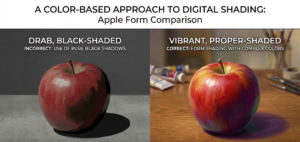
Avoid Using Pure Black for Shadows
The most common hallmark of amateur digital art is selecting a base color, dropping its brightness to black, and using that for a shadow. In the real world, shadows are rarely pure black. They are influenced by the ambient light of the environment. Using black makes illustrations look muddy, drab, and lifeless.
Instead, practice color temperature shifting. A good rule of thumb is to use cool colors (like deep blues or purples) for shadows, and warm colors (like yellows or oranges) for highlights. This contrast in temperature creates vibrant, dynamic depth.
Managing Perspective and Value
Digital screens are backlit, which can trick your eyes into thinking your image has more contrast than it actually does. To ensure your piece reads well, you must establish strong values (the lightness or darkness of a color).
A practical trick in software like Clip Studio Paint is to create a new adjustment layer (Hue/Saturation) at the very top of your layer stack and turn the saturation down to zero.
Toggling this black-and-white layer on and off lets you quickly check if your image has enough contrast to pop, or if it all bleeds together into a middle-gray mush.
The Beginner’s Pre-Flight Checklist: Avoid These Mistakes
When starting, missing a technical detail can ruin hours of work. Run through this checklist before and during your drawing process.
- Check Canvas Resolution First: If you ever plan to print your work, your canvas must be set to at least 300 dpi (dots per inch) when you create the file. Web images default to 72 dpi. If you draw a masterpiece at 72 dpi and try to print it, it will be an unusable, blurry, pixelated mess.
- Constantly Flip the Canvas: When you stare at an image for hours, your brain stops noticing severe anatomical errors. Use your software’s “Flip Canvas Horizontally” shortcut. Reversing the image acts like holding a traditional drawing up to a mirror, instantly revealing wonky eyes or skewed proportions.
- Don’t Over-Detail: Just because you can zoom in 800% to draw individual eyelashes doesn’t mean you should. When viewed at a normal size, microscopic details clump together and look like noisy clutter. Zoom out frequently to check how the piece reads as a whole.
- Automate Your Backups: Digital artists will inevitably experience a hardware failure. A dead iPad, a corrupted hard drive, or a software crash can destroy days of work. Set your files to automatically sync to a reliable cloud storage service, and keep a physical external drive backup.
- Never Paint on the Background Layer: Most software generates a locked white background layer by default. If you draw your linework directly onto this layer, you cannot easily place colors underneath it or extract the lines later. Always create a new, transparent layer for your actual drawing.
A Note on Frustration and Growth
It takes time to switch from traditional to digital illustration. Art is a skill that takes hundreds of hours of serious work to develop, unless you have superhuman genius. Your first few digital items will look and feel clumsy. The pen will feel too smooth on the glass screen, and you will end up painting exquisite details on the wrong layer.
This is a step in the procedure. Make sure you have backups of your previous files. After six months, look back at them and be amazed at how quickly you got used to them. You don’t have to learn every single blending mode and brush option on the first day.